Tag: 5 minute chart

  • Which chart should we use?

    We talk about charts, but what’s the difference between say a 5-minute and a 4-hour chart?

    One of the charts below is a 5-minute and the other a 4-hour chart. Which is which?

    snip20170121_1

    snip20170121_2

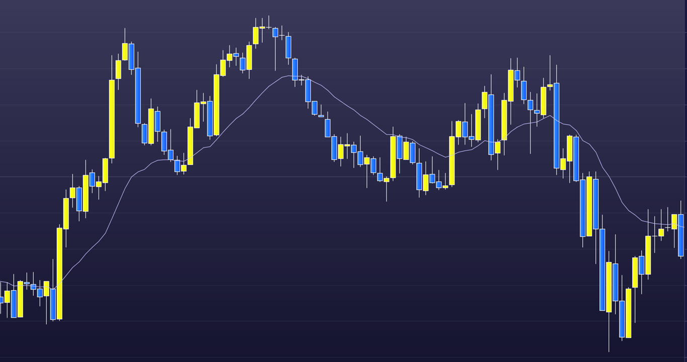
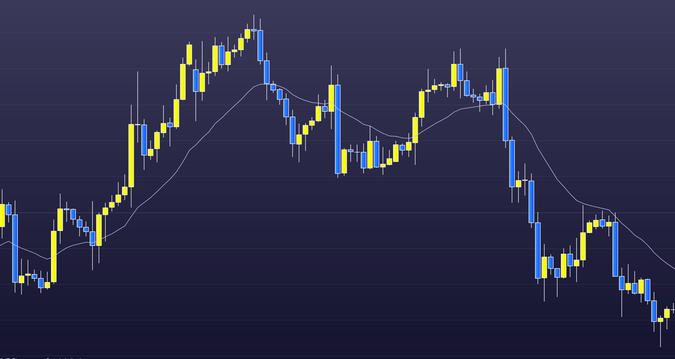
    The top chart is the 5-minute and the bottom the 4-hour, I think?

    The point is, charts are like the very large, the universe, and the very small, the atomic level, where there are (apparently) as many details in each.

    Each chart that we use is made up from these fellas. The candlestick.

    snip20170121_5

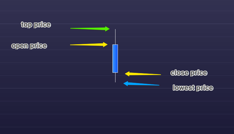
    We use candlesticks, but there are several ways to show price. On a 5-minute chart the time between the open to the close of the bar is, of course, 5 minutes.

    Different bar colours show a rising or a falling bar. We’ve gone for the colours above as it seems less straining on the eye.

    Many starting out choose lower timeframe charts. Five minutes or less. Lower time frame charts are seen by traders as quick reward for little risk – a protective stop can be placed only a few pips away. When their account decreases (which invariably it does) they then consider only risk. Both techniques are wrong.

    The problem with starting out on the lower time frame chart is that we are competing with ‘grand masters’ with only a few seconds to make a decision.

    The one-minute chart is where most traders are foolishly drawn. In comparison the 5-minute chart seems positively pedestrian. Except that the 5-minute candlestick above often closes with a very different form in the final seconds of its life. Not easy.

    On the other hand, higher time frame charts are not as concerned by the regular pitches in the market due to short-term news and give us time to consider: the all important context (all the bars to the left), possible set-ups and – what the shape of the closing bar is telling us – the price action.


  • Monthly Slow Trader Fund update – 5th December 2015

    Slow Trader Fund is up by a total of 8%. Here’s individual positions:

    Snip20151205_29

    You may recall from recent posts that I’m spending more time developing day-trading abilities. That is: trading from the 5 minute chart.

    Slow Trader is a daily chart fund. This has not changed.

    However, development of day trading technique will be of great benefit to the fund.

    That is because price action in each time frame is similar. Trade management, trade frequency, assessment time and pressure are different.

    Trading in the 5 minute chart demands a constant (all day usually) watch of the chart. My style is to watch only one chart when in the 5 minutes. And from this one chart there are usually many opportunities in the day to trade.

    In contrast, far fewer opportunities are available for trades from the daily chart. Therefore, usually a number of different (daily) charts can be analysed.

    A successful day trader (and I mean the 5 minute chart, as the one minute chart is intense and draws a trader down the path of extreme scalping rather than – my prefered – trades which are broad scalps and swings) can profitably trade the daily charts.

    The same is not true in reverse.

    The benefits for the fund in my being able to trade the 5 minute charts is exponential.

    The New Year goal for the Slow Trader Fund is growth at a monthly rate of 5% to 10%. Ambitious but, I think, doable.

    Next fund update is 6th February.

  • Price action or fundamentals

    As previously mentioned, I’m presently focused on trading 5-minute charts EUR USD. To master price action trading, and with a low time chart such as the 5 minute, takes all my undistracted concentration. I think that, most, professional traders use price action. Some may voice that they also use fundamentals and certain indicators, but when it comes down to the profits it’s usually price action, in some form, that’s responsible.

    My trades on the 5 minute charts last from a few minutes to usually no more than an hour. Therefore, fundamentals have no influence. Although some traders consider fundamentals, they are generally the ‘go to’ consideration of the investor rather than the trader. An investor can be considered as a longer-term commitment, a duration where the fundamentals have time to take effect – many months to years. I studied fundamentals for several years. However, I now feel that even the highest term charts, such as weekly’s or monthly’s, are (primarily) influenced by price action and therefore ‘technical’ rather than ‘fundamental’ reasons. That is because price action is a measure of psychology in the market – such as: fear, greed and confidence.

    Notice below how the recent attacks in France effected the S&P 500. Notice also that the drop, before the S&P’s quick recovery, bounced off a 50% retrace line. A line that I had drawn on the chart several weeks ago. This is a part of price action, the context, and is known as a measured move. Often this measured move is exact – whether it’s a 5 minute chart or a daily chart as the one below. The news (France) moved the market, but price action told it where to go too.

    Snip20151118_22

  • Slow Trader Diary – week 40

    A small move in the right direction, we’re now up by a total of 3%.

    I won’t break this down into broker costs as I think you’ve got the idea of broker costs now. Also, I will only show the percentage gain as a whole number (rather than its actual of 3.74%, as we have trades open and therefore the percentage is only a snapshot).

    Again, this month has been light on trading as the S&P, on the daily charts, is at a junction. Let me explain:

    Snip20151010_4

    The S&P 500 is at a trading range turning point. From here the S&P is statistically more likely to go down and stay within the price range of the last few weeks.

    This is reflected, to some degree, in individual shares within the S&P. And here’s the trading dilemma. We have to be patient and wait for the next move to show itself before we commit.

    Fake moves may also occur that dummy one way and go another. Part of the joy of trading.

    80% of trading range moves will stay within the trading range. Therefore, statistically, we favour a down move at this point. However, a breakout of the range, and a move up, is clearly a probability. A 40% to 50% probability.

    There are many price action techniques that will guide us as to the next move as it develops.

    Returning to the week already traded, here’s where we got our gain. It’s a trade, taken unusually for the Slow Trader fund, on the 5 minute chart. As there was nothing on the daily charts I took a day trade similar to one in my personal fund. Here it is:

    Snip20151010_7

    For those not familiar with charts in different time frames this can be odd. The 5 minute chart immediately above is the S&P price movement throughout a single day shown in 5 minute bars. In other words, the chart immediately above is the price movement within the very last, rather small, bar of the top chart above.

    We made money from the market going down. I’m not saying from this that I’m favouring the S&P market going down, just that for that part of the day we had a 60% chance of the market dropping. So we took it. Our exit was (in this time frame) at a major support level.

    You will notice from the chart above that after we took the trade we dropped to, what I would call, a minor support level. We were in nice profit, and then the market turned back up again.

    This is a swing, and is something an inexperienced trader finds hard to manage. An inexperienced trader jumps ship too soon. Our target was the major support, however, we had to see our profits build – go back to zero – and then build again, as we roller coaster our way to our target exit point.