Tag: daily chart

  • Profitable gold and silver – missed USD CAD

    A good week with profitable trades in gold and silver. The week did come with a small loss and missed opportunity in the currency pairing USD CAD. Also, we were out of the money for much of the week in crude oil only to grab a brief break-even buy back moment. Overall, a good week.

    Silver daily chart: each bar represents one day’s worth of trading. A black bar means the price closed lower than the open. Each candle (as they are called) shows the open and close price and the wick (either top or bottom) shows how high or how low the price actually went between the open and close times.

    Snip20160521_1

    We shorted silver at the red arrow and we bought back that short at the green arrow. Just over 80 pips of profit for us; a pip is the smallest upwards or downwards movement. (In stocks and shares it is called a tick.)

    Gold daily chart:

    Snip20160521_2

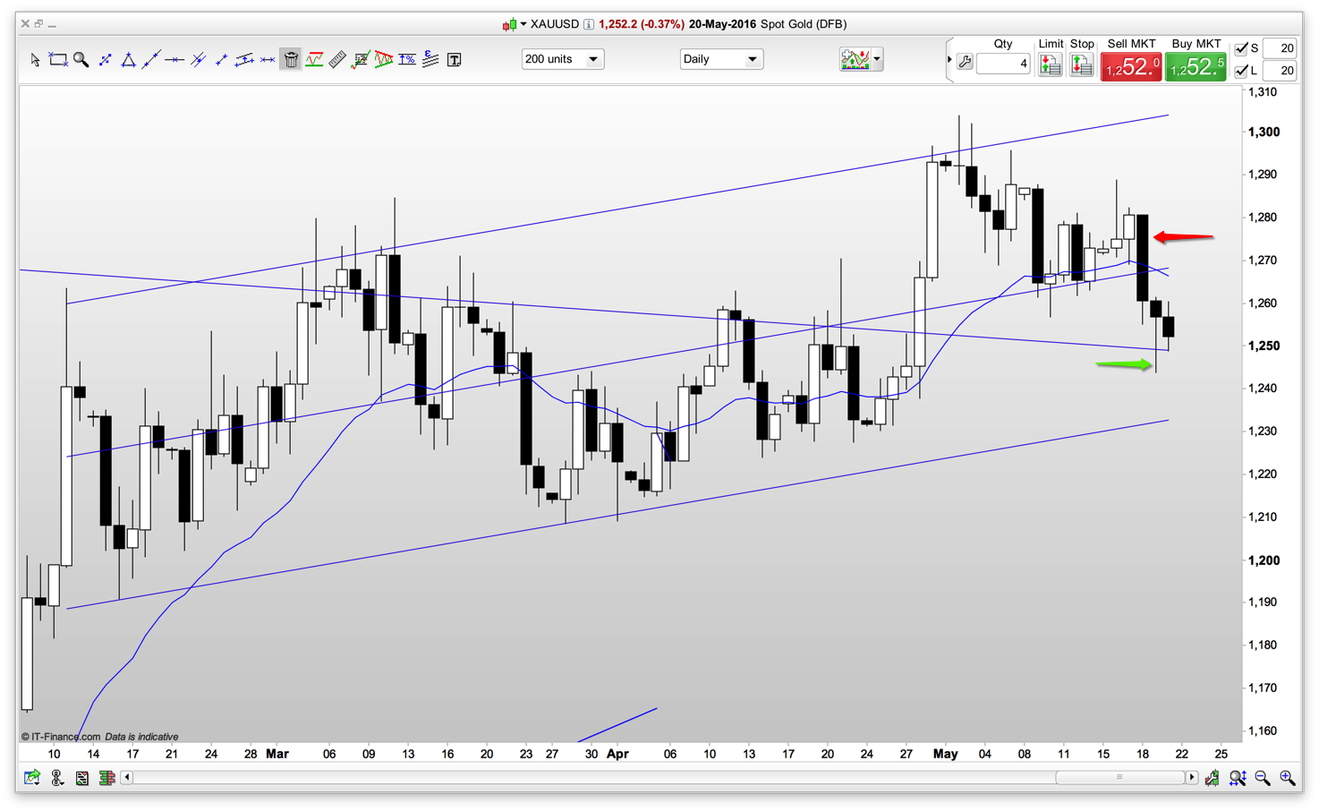
    We shorted at the red arrow and bought back our short for a profit at the green arrow. Gold trades less than silver per ounce and therefore our gold movement this week represented only 30 pips. However, the smaller size is offset by the traders equation: based on probability, our profit target, how far away our stop is and the representative amount we’re prepared to lose.

    USD CAD daily chart:

    Snip20160521_3

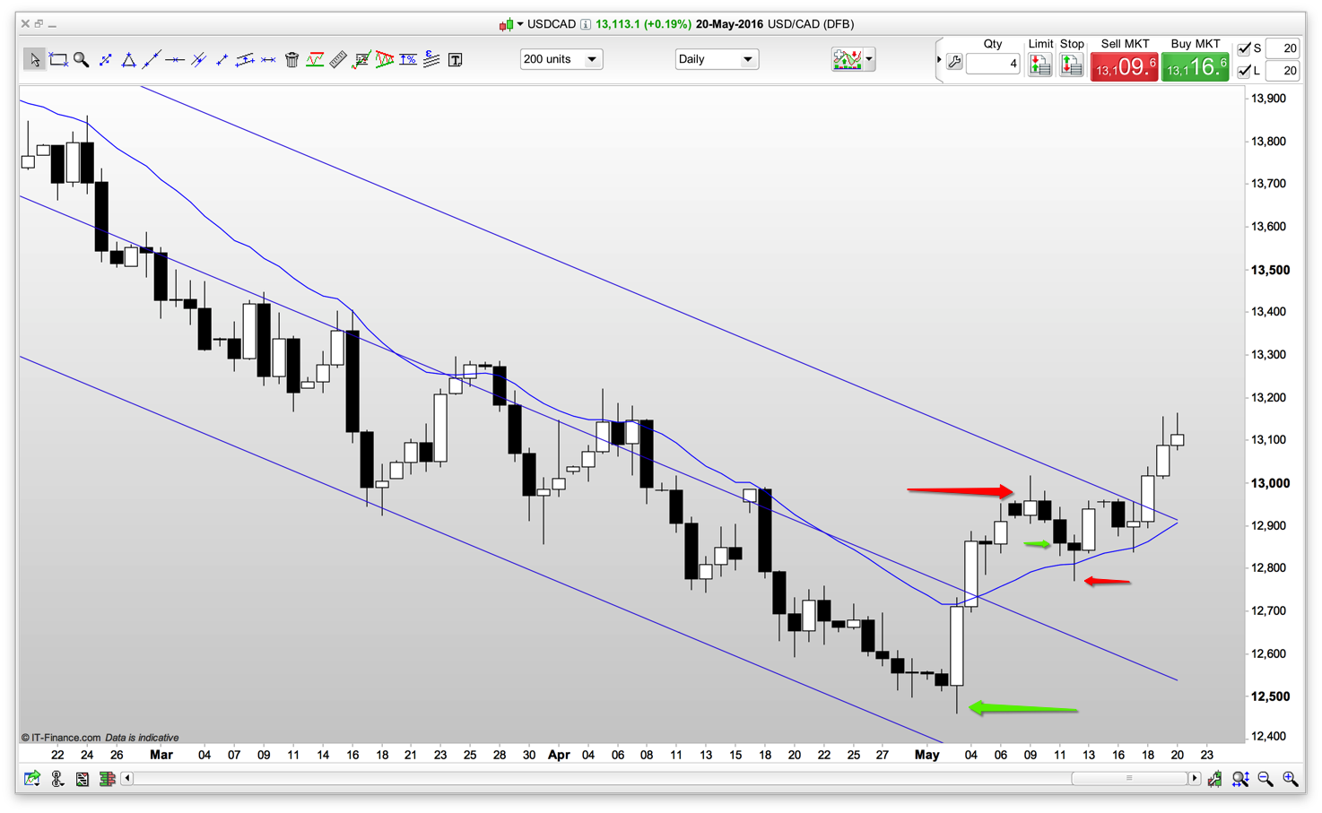
    Over the last few weeks we went long at the larger green arrow and took our profits at the larger red arrow.  We went long again a few days later at the smaller green arrow only to be stopped out of the trade (within a couple of pips!) at the smaller red arrow for a small loss. I then missed the subsequent move up. That is trading. Did I set my exit stop at the wrong place? Maybe. Hindsight is a wonderful thing, and a few more pips below the moving average would have been sensible. But my overall judgement was correct, in that the price was going to go up – and I take confidence from that.

    Crude oil daily chart:

    Snip20160521_4

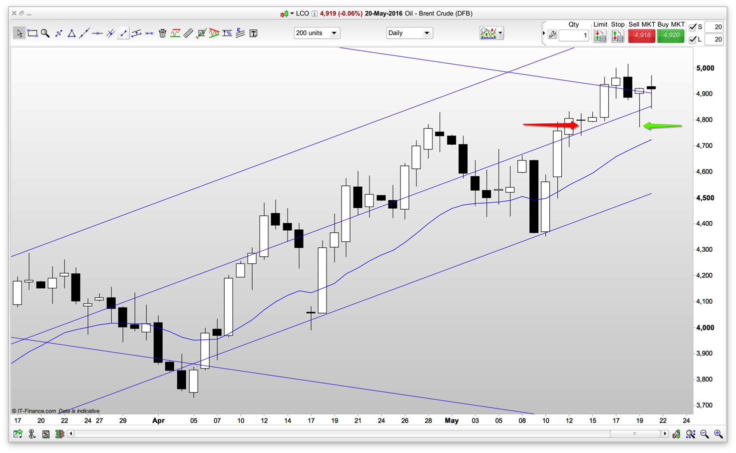
    My best trade of the week without making any profit. Let me explain. We shorted at the red arrow and were out of the money all week to the tune of 200 pips at one point. We bought back our short at break even price at the green arrow. Best trade because although we were out of the money we did not reach our stop position and we managed a break even price. Ready for the next one!


  • Slow Trader Diary – week 40

    A small move in the right direction, we’re now up by a total of 3%.

    I won’t break this down into broker costs as I think you’ve got the idea of broker costs now. Also, I will only show the percentage gain as a whole number (rather than its actual of 3.74%, as we have trades open and therefore the percentage is only a snapshot).

    Again, this month has been light on trading as the S&P, on the daily charts, is at a junction. Let me explain:

    Snip20151010_4

    The S&P 500 is at a trading range turning point. From here the S&P is statistically more likely to go down and stay within the price range of the last few weeks.

    This is reflected, to some degree, in individual shares within the S&P. And here’s the trading dilemma. We have to be patient and wait for the next move to show itself before we commit.

    Fake moves may also occur that dummy one way and go another. Part of the joy of trading.

    80% of trading range moves will stay within the trading range. Therefore, statistically, we favour a down move at this point. However, a breakout of the range, and a move up, is clearly a probability. A 40% to 50% probability.

    There are many price action techniques that will guide us as to the next move as it develops.

    Returning to the week already traded, here’s where we got our gain. It’s a trade, taken unusually for the Slow Trader fund, on the 5 minute chart. As there was nothing on the daily charts I took a day trade similar to one in my personal fund. Here it is:

    Snip20151010_7

    For those not familiar with charts in different time frames this can be odd. The 5 minute chart immediately above is the S&P price movement throughout a single day shown in 5 minute bars. In other words, the chart immediately above is the price movement within the very last, rather small, bar of the top chart above.

    We made money from the market going down. I’m not saying from this that I’m favouring the S&P market going down, just that for that part of the day we had a 60% chance of the market dropping. So we took it. Our exit was (in this time frame) at a major support level.

    You will notice from the chart above that after we took the trade we dropped to, what I would call, a minor support level. We were in nice profit, and then the market turned back up again.

    This is a swing, and is something an inexperienced trader finds hard to manage. An inexperienced trader jumps ship too soon. Our target was the major support, however, we had to see our profits build – go back to zero – and then build again, as we roller coaster our way to our target exit point.